Thursday, 15 December 2016
Monday, 5 December 2016
[AUDIENCE/RESEARCH] Institution Research
For this product, my fictional artist is "signed" to Island Records, which was founded in 1959 and exists as a division of Universal Music Group (UMG). As a well-established institution in the music industry, the mere label of the corporation is enough to provide an artist with credibility and the assurance that they will deliver impressive music. This was the image I wanted to provide my artist with - reliable and, ultimately, talented.
Some notable names included in the label's UK roster includes those of a similar genre to my fictional artist, "Sydney Stone", such as:
Upon further inspection of the record label's website, it is implied that their intended demographic is young adults aged 16-24. This is, firstly, evident from the types of artists they have listed which are signed to them but also from the graphic design of the website. The layout is grid-like, making it easy to navigate, and vibrant, reflecting their youthful audience.
Moreover, there is a banner across the top of the screen which depicts a shelf of vinyl records. The notion of vinyl records correlates with the indie genre and reflects "reformer" youth in the 20th Century, which mirrors the retro aesthetic of my artist's music video in terms of the filters and styling used.
Overall, from the research I conducted, Island Records was the most suitable label to have my artist partnered with.
Some notable names included in the label's UK roster includes those of a similar genre to my fictional artist, "Sydney Stone", such as:
- Aquilo
- Ben Howard
- Hozier
- Laura Aquilina
- Mumford & Sons
- Of Monster and Me
Upon further inspection of the record label's website, it is implied that their intended demographic is young adults aged 16-24. This is, firstly, evident from the types of artists they have listed which are signed to them but also from the graphic design of the website. The layout is grid-like, making it easy to navigate, and vibrant, reflecting their youthful audience.
Moreover, there is a banner across the top of the screen which depicts a shelf of vinyl records. The notion of vinyl records correlates with the indie genre and reflects "reformer" youth in the 20th Century, which mirrors the retro aesthetic of my artist's music video in terms of the filters and styling used.
Overall, from the research I conducted, Island Records was the most suitable label to have my artist partnered with.
Friday, 2 December 2016
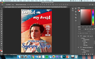
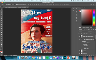
[PRODUCT] Ancillary Product - Progress of Production (Music Magazine Album Advert)
Applying background image - used for both advert and front cover of digipak
Title of the album - same font as on the album cover
"The brand new album" - connoting a comeback, rather than a debut.
"Sydney Stone" - same font used throughout all the products (advert, digipak and music video) - establishing a sense of brand identity.
Inserting the titles of the singles included on the album - a convention of album adverts.
A quote from a review of the album from Pitchfork (an online music magazine owned by Condé Nast - "the most trusted voice in music").
Institution logos pasted in bottom left-hand corner
Link to artist's website - "www.sydneystonemusic.co.uk"
Logo for "Available on iTunes" in bottom left-hand corner
ALTERATIONS MADE:
This version of the music magazine advert uses a different background image to the versions I previously posted. The reason behind this change is that I created the inside of the digipak using a different filter on Prisma ("Dreams") which resulted in this effect.
The image I used for the other versions did not suit with the effect of these images so I used the same filter for the front image in order to match with the house style.
Subscribe to:
Comments (Atom)


