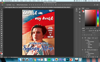
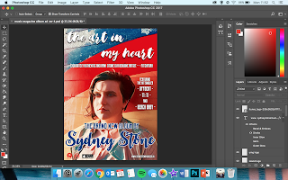
Applying background image - used for both advert and front cover of digipak
Title of the album - same font as on the album cover
"The brand new album" - connoting a comeback, rather than a debut.
"Sydney Stone" - same font used throughout all the products (advert, digipak and music video) - establishing a sense of brand identity.
Inserting the titles of the singles included on the album - a convention of album adverts.
A quote from a review of the album from Pitchfork (an online music magazine owned by Condé Nast - "the most trusted voice in music").
Institution logos pasted in bottom left-hand corner
Link to artist's website - "www.sydneystonemusic.co.uk"
Logo for "Available on iTunes" in bottom left-hand corner
ALTERATIONS MADE:
This version of the music magazine advert uses a different background image to the versions I previously posted. The reason behind this change is that I created the inside of the digipak using a different filter on Prisma ("Dreams") which resulted in this effect.
The image I used for the other versions did not suit with the effect of these images so I used the same filter for the front image in order to match with the house style.


No comments:
Post a Comment